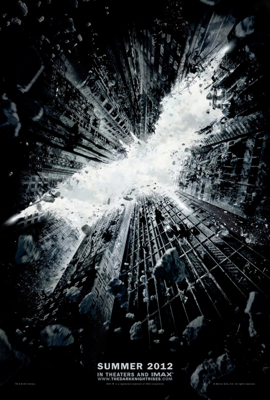
One of the most anticipated film of 2012 now has something official for fans to get excited about. Seems like every other minute I see a tweet from someone who claims to have something about the movie… but I try to curb my excitement by not paying attention to them. But now, my enthusiasm just em, rises tenfold.
Behold …

Wow, this looks beautiful! It’s enigmatic and evocative, just like most promos for Chris Nolan’s movies (and the architecture style reminds me a bit of the Inception posters, too) The flying debris from the buildings create that gritty look and the way the skyscraper makes out the bat outline is pretty clever. Back in April, I put up this post highlighting this cool fan-made poster of TDKR, and it has a similar feel and it also had the bat outline featured prominently, but this one is even more dramatic and obviously the designer actually has some massive dollar amounts to work with.
I could almost hear the swooshing sound of his memory fiber cape as he takes flight and the crashing sound of the falling debris. So is the poster suggesting that our dark knight ‘rises’ from hitting rock bottom to emerge as the hero Gotham desperately needs? Whatever it will be, I think we can expect something epic from Mr. Nolan.
Btw, based on some of the tweets I’ve been reading lately, looks like the teaser trailer shouldn’t be far behind. There are rumors that it’d be released in front of the final installment of Harry Potter & the Deathly Hallows out this weekend. Too bad we have a full year to wait until the film is released on July 20, 2012!
So what do you think of the teaser poster? Are you as excited for this movie as I am?

The poster is okay… kind of reminds me of Inception also.
I am looking forward to seeing this movie but not as excited to see it as I was w/ The Dark Knight.
Hi Luv, yeah I think Nolan likes structural buildings doesn’t he? I wonder if he’ll ever do a poster that’s more organic looking, ahah.
I think the cast is tremendous for this one but you’re right, TDK had the amazing Heath Ledger and those Joker posters were pretty darn intriguing!
I have 2 words for you that have dampened my spirits somewhat: Anne Hathaway
Yeah, I’m not keen on her casting either, glad I’m not the only one!
Not a fan of her but I seriously doubt she would dampen anything in this otherwise seriously good cast…
Yeah, at least she’ll probably be way better than Katie Holmes in Batman Begins! That’s the only flaw in an otherwise stellar cast.
Yes! thank you ruth! I also didn’t like Holmes in BB at all!!!!!
I think if the role is written well hathaway will do fine. She was good in Racheal getting Married, and she wasn’t bad in ALice in Wonderland
I’m rather surprised Batman himself isn’t in the poster, but i suppose it is called a “teaser” poster for a reason.
He was in the poster, he just flew away too fast 😀
I don’t know which I loved seeing more. The intriguing imagery in the graphic, the fact they’ll deploy this in IMAX once more, or that there’s no advertisement for it being in 3-frakkin’-D! Thanks for the heads up, Ruth.
Ahah, yeah, you’re right!! I’m glad Nolan isn’t keen on the whole 3D bandwagon. Studios ought to spend the money on the writing and the talents instead of on those extraneous 3D conversion crap.
Pretty bloody awesome poster, indeed. I look forward to the multitude of posters the Warner Bros. marketing department employs; their work on DARK KNIGHT was provocative and utterly brilliant, and I’m interested to see what they come up this time where they don’t have the star power of Heath Ledger and the fan love of the Joker. Play up on Catwoman’s sexuality? The seemingly creepiness of Hardy’s Bane?
Either way, a whole frakking year seems EONS away! Thanks for sharing, mate.
I just hope they won’t have a new one every other week like Harry Potter, it just gets to be too much, yes even too much of a good thing is still bad.
Btw, are you gonna try to participate in TCFF this year, Andy?
Doesn’t look like I’ll have a chance to go to the TCFF. I’ll still be in Mankato during that period of time, and I don’t have a method of transportation. I keep trying to suggest to my bosses they should send a limousine to pick me up, but thus far, the response has been lots of chuckling. Hope you have fun, though, mate.
That’s too bad, Andy. I hope somehow you find a way to perhaps spend a weekend in the cities so you can attend.
LOL I am not feeling it at all on this poster. I am all a bit ‘meh’ about the whole affair. I have been heart broken too many times this year by films that I really loved the look of and then failed miserably on release. I am keeping my judgement close to my chest.
We shall see
Oh, you gloomy gus you 😀 Just kidding, matey, I hear ya. Lots of movies do get hyped up too much that it’s hard to live up to them. But I trust Nolan that he’d um, rise above the hype (pardon the pun) and give us something epic that concludes the franchise beautifully.
Hey did you like Horrible Bosses last night, matey?
I take it you were really looking forward to Red Riding Hood.
Love the poster…looks dark and mysterious. But, I am not yet excited 😉
Not yet excited? Isn’t Cillian going to be in this one, too?
Not sure yet. But if so…I will be there 😉
Btw,people here are so angry with the government…they most likely couldn’t watch Harry Potter
Hi, Ruth and company:
Wicked cool looking poster!
Great first step toward what appears to be a great film.
Hello Jack, always nice to see you popping by.
Let’s hope the film is even better than this poster!
Love the Batman logo there, very cool design. I think they must’ve went through a lot of design comps to before settled on this one. I’m gonna try to not pay attention to all the hype about this film, it’s going to be hard especially since the teaser trailer is coming out this week. I remember for The Dark Knight, I knew everything about that film before it opened, so I’ll try to stay away from spoilers for this film.
I’m going to see the last Harry Potter film on IMAX so hopefully the trailer will be shown there, hopefully we’ll get to see some of the IMAX sequences. Wally Pfister, the director of photography, said the opening scene of this film will be much more spectacular than The Dark Knight. Rumors been going around that the opening scene will be a prison breakout since Batman is a fugitive, not sure if that’s true or not but I can’t wait to see it.
Hi Ted, glad you like it, too. Yeah, I bet there were thousands of comps, I’m curious to see what they look like in comparison to this one. I think Nolan loves architecture, there’s always buildings in the background on his posters it seems like.
Yeah, I try not to pay too much attention to TDKR as much, I don’t even want to remember what you’re telling me about the opening sequence, ahah. I want to see it w/ fresh eyes as much as possible!
I hafta agree with some of the comments I am seeing online in that, while the poster seems imposing and makes Gotham look like it is crumbling and falling apart, it also looks like INCEPTION meets Batman.
It keeps the theme of using the silhouette of the bat like TDK did, but I am waiting for later posters that can tease us with Bane and Anne Hathaway and more!
Still waiting for the trailer!! but did you see this fan-made trailer?! I was pretty impressed! http://www.youtube.com/watch?v=-l692LjkGIY&feature=player_embedded
Yeah, I think the comparison is pretty obvious, I wonder if it’s intentional? If so, why? Nolan always gets us in a tizzy, doesn’t he? 🙂
I’m one of the few who aren’t too keen on Hathaway’s casting, but Tom Hardy… oh yes, bring it on!! he..he..
That’s a cool trailer, thanks for sharing. I wish I knew how to make a Youtube video like that, lots of talented fans out there.
I don’t think it evokes any strong feeling or emotion but it’s pretty good looking. This definitely reminds of the style of Inception so let’s hope the movie doesn’t feel that way lol
I certainly hope not. I like Inception but I wouldn’t want to see a replica of that in Nolan’s Batman flick.
Did anyone else notice the Superman logo on the lower left side of the poster? Maybe Nolan is giving us hint that the two films might merge someday, Superman vs. Batman film?
What? Where? I’ve looked at this giant version very closely and didn’t see it http://www.thehighdefinite.com/wp-content/uploads/2011/07/TheDarkKnightRises_TeaserPoster.jpg
Just sent you the poster with red circle around the Supe logo, it could just be something else but it sure looked like Superman’s logo to me.
Vaguely but I think it’s just a random stain 😉
That’s what I thought too, Castor. I’m sure the designer is having a field day seeing the reaction of what probably is pure coincidence, ahah.
Or the designer decided to just put it in there to see if anyone can catch it, you know how we designers does things like that. Personally I sometimes put some abstract stuff on some of my design work, I don’t think any of my clients notices anything. He he. 🙂
Inception meets Batman…? I’m there 🙂