From now until New Year’s, I’ll be posting various Top Ten list of 2010 movies. I love movie posters, so I might as well start with those. Thanks to Luke @ Cynicritics for selecting The Art of Movie Poster from back in April in his list of most wonderful posts of the year. I’m so honored!
Well, the criteria for selecting my favorites are based on creativity, uniqueness, and use of composition/color/angles that make them so eye-catching and also memorable. I’d easily choose any of these to display in my home if I were to put movie posters around the house. So without further ado, here are my top ten faves in random order:
1. Black Swan
All of the Black Swan posters are pretty spectacular (you can view them all here). There’s one with feathers all around framing the poster, as well as black/red art deco illustrations that are well, pretty artsy. But without a doubt this one is the most striking of all to me. It’s got almost a haunting quality with the broken porcelain face. Natalie Portman’s symmetrically gorgeous face has never looked more breathtaking… or more mysterious.
2. Never Let Me Go
I’ve blogged about this poster back in July. The simplicity of it is beautiful. At first glance, it feels blissful and innocent, it almost has a nostalgia quality about it. Yet somehow you know there is more to it than meets the eye, which is the core of the movie’s plot. The fact that the lower part of the word GO is cut off is like a little clue.
3. From Paris with Love
…

…
I absolutely adore this one, and not only because I love anything to do with the Eiffel Tower. Sooo imaginative and simple, but delivers such an impact. If only the movie is half as clever.
4. Inception
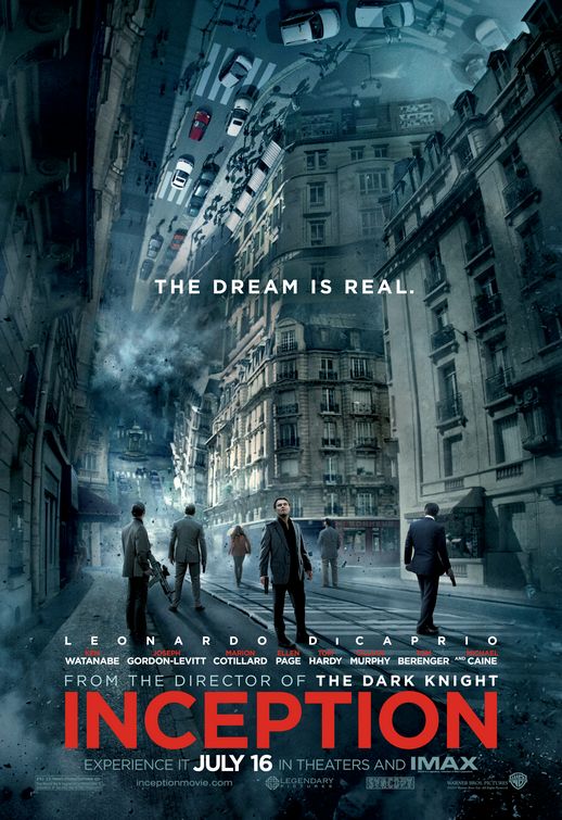
The whole marketing for Inception is all around cool. It captures the enigmatic quality of the film and the bold red font really complements the moody bluish tone. The banners are equally noteworthy, or as I said in the post, absolutely drool-worthy.
5. I Am Love
…
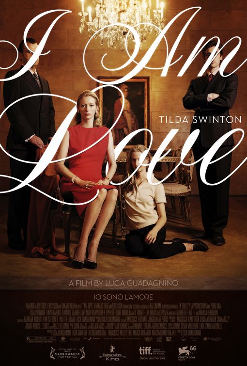
I am in love with this poster. I’m a sucker for cursive font, but if not used properly, it can feel outdated and old. But in this poster, it still feels pretty contemporary whilst still evoke the romantic tone of the film. I love the way the top of the ‘L’ wraps around Tilda Swinton. I’ve heard mixed reviews about the movie itself but the poster definitely get top marks from me.
6. Rabbit Hole
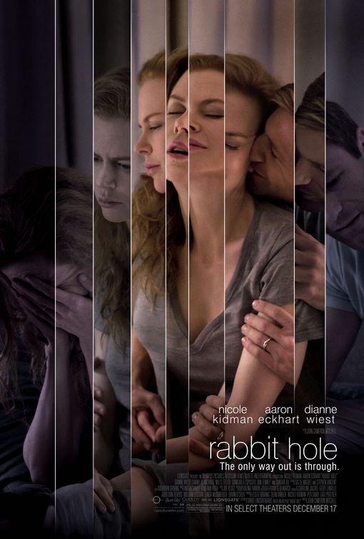
The theme of this movie is quite bleak, it centers on a happily-married couple whose life is turned upside down after their young son dies in an accident. It’s rare that a poster actually goes deep into the psyche of the film it promotes, but this one practically does the job. As Andrew said in his post, “So subtle, and yet it’s kind of jarring and garish.”
7. The American
I adore the 70s retro look of this design., it almost look like something for a Steve McQueen spy thriller. Perhaps try to lure audiences of George Clooney’s age as well as the younger audience who thinks retro is trendy and cool. As the film centers on an assassin hiding out in Italy for one last assignment, it captures that reclusive mood and the female face in the background hints at a love story as part of the plot. Simply brilliant.
8. 127 Hours
Everything about this poster grabs you: the composition, the colors and obviously what’s happening right in the center of it. If you already know what it’s about, you’d surely appreciate the fact that the simple design tells the story. But if you don’t, you’d surely be curious enough to find out what it’s all about. Based from the reviews, the Danny Boyle movie certainly lives up to this striking poster.
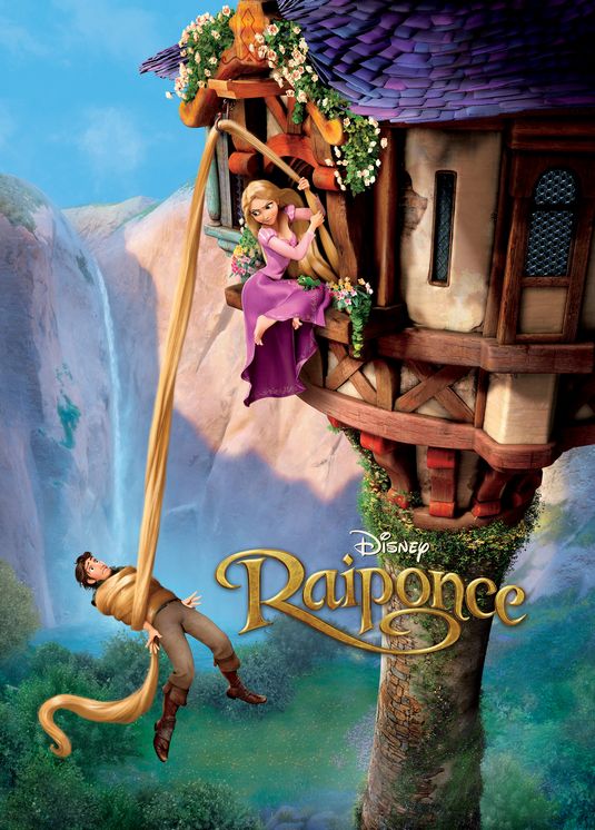
9. Tangled (French version)
I have a penchant for Disney Princesses but I’m not as enchanted by the American version. This French one however is all kinds of awesome. It’s whimsical but still has that romantic Princess-y quality about it and the colors and composition makes for a winning design.
…
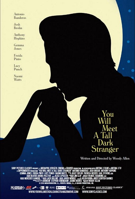
10. You Will Meet a Tall Dark Stranger
I generally love illustration design, and if handled well, they can be the most attractive. Such is the case with this Woody Allen movie poster. I blogged about this one as well back in August, and I still love it now as I did back then. It’s simply a beautiful design that’s unabashedly romantic and seductive. Not sure if the movie lives up to such a promise.
Honorable Mentions:
- The Kick-Ass poster is one of the four character posters that you can view here. First thing that came to my mind is awesome! I love that each of the poster has the character’s back towards the camera, as if to say convention be darn! Yet it still conveys the whimsical aspect of the whole story.
- Buried isn’t one I’d actually hang on my wall, but I give points for its creative use of typography and the Hitchcock-ian quality.
- The marketing dollar behind the new TRON movie is impressive, there are dozens of them! Fortunately, they all look pretty cool and definitely captures the hi-tech and sleek look of the digital world.
- When I first saw the Somewhere poster, I thought it was an ad for a resort/hotel. But upon second look, I thought it’s kinda cool that it doesn’t look like a traditional movie poster. The Sofia Coppola film centers on a hard-living Hollywood actor who re-examines his life after his 11-year-old daughter surprises him with a visit. Just like her previous work, Lost in Translation, the sense of place displayed in the poster is a crucial part of the plot.
- The Alice in Wonderland quad is quintessentially Tim Burton-esque with the curly branches. It definitely has that otherworldly quirkiness quality that fits the story perfectly. And the colors are just downright gorgeous!
All posters are courtesy of IMPAwards.com
***
Well, that’s my list, folks. Now, what are YOUR pick of most eye-catching posters?





Catfish and Scott Pilgrim gets second-tier honourable mentions. But most of what you picked are better than the two posters I named. 🙂
I remember Catfish’s poster, definitely piqued my interest. Glad you like my selections, Paolo.
I like that “I Am Love” poster quite a bit. It looks like it’s right out of the Criterion Collection. The poster for “The American” is really cool too- it reminds me of a lot of 50’s and 60’s film posters that meld a grayscale image with a spot color.
I love the retro feel of both of those, hard to look away from both of them.
Those are great, just wish that when the films comes out DVD/BD, they would put the same poster on the cover. But nope, most of the time the studios decided to just put some crappy cover on DVD/BD. For example, the Bourne films has great posters but their DVD/BD covers were awful.
Man, I absolutely agree with you! I don’t know why they do that. I mean if they’ve invested money in creating the original poster, why not just use ’em?
Black Swan has had the best ad campaign.
Indeed, I enjoyed most of them.
Totally agree. But this one with Natalie’s face is the best of all IMO.
I’m going to be lame and state that I like the posters for Robin Hood and Due Date, for obvious reasons. Even though I still have no intention of seeing the latter. 😉 I like your list!!
Oh it’s not lame, I kinda like the Robin Hood one with Russell’s close up aiming the arrow.
Glad to see you’re back blogging again, hope all is well with Lyra… you must have your hands full!
I liked the Saul Bass throwback for Buried more. I liked The American poster so much I got it for my dorm room.
Great choice for your dorm there, Fitz! It’s so cool looking but I heard the movie itself is rather boring… shame.
RABBIT HOLE would be the only one I like, it’s really profound and creative!
Yeah, I like the first one too of the tire swing and transparent letters, but then I saw this and was like, ‘whoa!’ Profound indeed.
I actually saw Eyes Wide Shut yesterday. When Nicole has a good role, she is magic. Unfortunately her choice of roles has gotten rather poor in recent years.
I agree. She was amazing in Moulin Rouge as well. I generally think she’s a fine actress but I agree her role choices is sometimes questionable.
I actually got a Supernatural poster for my room. When i went to comic-con there was some people selling a bunch of movie and tv show posters, and i was conflicted between getting the Supernatural one and a Jessica one as i only had money for 1. While my love for Jessica hasn’t faded, i’m not as into True Blood as i once was, while SUpernatural hqs remained as one of my top shows. And i figured there will be plenty of other opportunities to get a Deborah poster anyways(i could order the Jessica poster from the HBO site, but i don’t have the money for it). Btw, did you see her photos in Allure? The reason i ask is because i remember you mentioning you saw her in some magazine before
And here is a link to the poster i got http://www.everythingsupernatural.co.uk/images/postertvseries.jpg imo a awesome looking poster
Hey Julian, did you go to the San Diego comic-con?? I’m still hoping to go next year but the stupid registration on their site is epic fail!!
Which one is Jessica again?? I remember Deborah, I’m surprised you didn’t have a poster of hers 😉 No I haven’t seen her in Allure, but I might this weekend when I go to Barnes & Noble.
Well, the only thing awesome about that poster is the main guy’s cheekbones 😀
I went to the New York Comic-con. And Jessica is the red headed teen vamp on True Blood(I just got my blog entry on her up). They also had a few Jessica ALba posters, which seemed more about showing off her sexiness than really promoting anything 😛
And one of the allure pics was…well, i couldn’t stop staring at t
And i like the shadow in the poster…but then again i may be biased due to my love for the show
Thanks for the shoutout! Yeah, I like this list… a lot. Rabbit Hole and I Am Love are fantastic picks. And for some reason I have not seen that Black Swan one yet.
I would add the Social Network.
No, thank YOU! Glad you like this list, Luke. That Black Swan one came later than the rest I think, but when I saw it I was really taken by it.
Social Network is pretty creative but I didn’t exactly love the look of it.
That buried poster is WAY better than the one i have on my DVD’s cover. That”s more dramatic.
I’m going to steal your Inception’s poster for my top-5 in cinema post, the one I have in my blog is not as awesome as that one.
Well as Ted said, for some reason studios always replace the dvd cover with a different one from the poster and it’s usually awful!
Steal away Nov, that is a niiice looking poster! 😀
I really like From Paris With Love! That poster is amazing! This is a great idea for a post, Ruth! My friend, Meccadawn, would LOVE this post. I will send him the link!
Hey, glad someone agrees with that one. It’s one I really wouldn’t mind buying. It almost has a James Bond-ish quality to it… they should’ve thought of that for A View to Kill.
Pingback: “Trailer Time Thursday!” 12.30.10 « Scarletsp1der's Blog
Pingback: Open Bar: New Year’s Eve Edition — ANOMALOUS MATERIAL
Scott Pilgrim was a terrible movie but had a pretty cool poster.
Yeah that was pretty creative. Haven’t seen the film so I can’t say anything about the movie.
I personally liked the film but everyone is entitled to there own opnion
Hey Ruth, I submitted this to Reddit. You should get some more eyes on this 🙂
THANK YOU Castor, you’re a real pal!
Great idea for a list, Ruth. I love movie posters and it’s nice to see some appreciation for them. Good picks, too.
I’d probably pick the Inception poster. I always preferred the posters that had some decent artwork to them, like the older style posters from the 80s. I wrote a blog about it, if you’re interested. http://celluloidzombie.com/2010/07/12/my-golden-age-of-movie-posters/
Just dropped you a comment, nice post Richard.
Posters will always be a regular feature on my blog. As a designer, I have a special affinity for them and my dad actually did some film poster illustrations back in the 50s and 60s. If only I had a fraction of his talent.
I know what you mean. I’m a designer, too. That’s great about your dad’s posters. Wow.
Hey, you have a great blog here! I’m definitely going to bookmark you!
I have a Movie blog. It pretty much covers movie related stuff.
Come and check it out if you get time 🙂
I kind of forgot about the poster for YOU WILL MEET A TALL A DARK STRANGER. That poster is lovely (there’s also one with the cards that’s just as nice).
I don’t know, I’m not really that fond of the poster for NEVER LET ME GO, I kind of feel that’s it doesn’t fit with the actual film.
I liked the TANLGED poster, in theory, but I still don’t buy Rapunzel being that kick-ass. It doesn’t make sense for someone cut off from all human contact, but there ya go.
(And thanks for the linkage! That poster is wonderful, and still not as wonderful as the movie.)
Yeah, all the poster designs for ‘Dark Stranger’ are lovely, I like the right one in this pic, too, that I posted a while back (https://flixchatter.files.wordpress.com/2010/08/talldarkstrangerposters.jpg)
You’re probably right that the Never Let Me Go one doesn’t fit the actual film, but I think that’s the idea. It seems so tranquil and blissful but it’s just on the surface.
I haven’t seen Tangled but I see what you mean, how does she get all that fight training? 😀
But, Ruth….WHY ARE THEY RUNNING? I don’t know, the firs titme I sw the poster (I still haven’t read the book) I thought they were on the run…For me the poster looks uneasy and the movie was sort of tranquil.
And come on, what sort of movie has Carey and Keira in it and doesn’t make use of their hotness on the poster? FAIL! 🙂
Well I don’t see it as running for their lives or anything. It’s more like y’know how kids sometimes run in excitement as they’re playing together… that’s what I get from the poster. But yet, beneath the seemingly blissful existence, something just doesn’t feel right. I actually like the fact that they’re not showing the beautiful faces of the actors in the poster… it’s not as manipulative.
Oooooh, now I’m getting in on this – Ruth. Damn, you’re a smartie. So they’re running like children, and really they ARE children because they don’t have any significant knowledge of adult life.
Okay, sold.
Ahah, well that’s my interpretation anyway, Andrew… not sure if that’s what Romanek/Garland actually have in mind. But yeah, they wouldn’t know what living as an adult is like… man, it’s so sad just thinking about it 😦
Why not the art deco style Black Swan posters? Were those not official posters?
I did mention the art deco styles on my post and yes I believe those are official. I decided to feature this one with Natalie’s face as it’s my favorite of all the posters.